Appendix
Category;
Case Studies
DATE PUBLISHED;
28.5.2025
Credits;
Read Time;
Watch Time;
4M
Case Study: Best
Founded in 2018 by director Ahron Best as Ahron Best Architects, Best is a Sydney architecture and interiors practice known for grounded, materially honest residential work across the city, coast and country. From its shopfront studio in Clovelly, the practice designs houses of tactile, elemental character, shaped by careful attention to light, outlook and setting.
Office D.SHARP worked with the practice to assess its brand and develop a marketing strategy that would bring its presentation into line with the quality of its architecture. The work led to a new name, a brand identity and website by Studio Hi Ho, new photography and visualisations, and a clearer statement of the projects the practice intends to pursue.
THE BRIEF
Ahron Best approached Office D.SHARP in early 2025 to help raise the practice's profile. Having built a considered body of residential work in Sydney, the studio was conscious that its brand awareness had not yet grown in line with the quality of what it was producing.
His aim was to reach a larger audience of design-focused homeowners and developers, to win more new houses in striking rural and coastal settings, and to refine the way the practice and its projects were presented, so that both would appeal more strongly to clients drawn to an ambitious design approach.
BRAND REVIEW
We began with a briefing workshop to understand the practice's values, objectives, ideal clients and key strategic challenges. We then assessed the studio's branding, website, imagery, social media and client-facing documents against a detailed framework, benchmarking the practice against a carefully selected group of peers in Sydney and Melbourne.
The practice already had much to build on. Its portfolio was tightly curated, its team was presented openly, and its visualisations of upcoming projects brought an elevated quality to the work still in development. There was room to develop the brand identity and website, the project photography and the written messaging, which did not yet convey the depth and refinement of the architecture with the same confidence.
POSITIONING
To inform the positioning, we interviewed past clients about their experience of working with the practice and their impressions of its architecture. They spoke of the understated character of the work, its honest use of materials and the calm, collaborative way in which each project had been led.
Drawing on these insights, we held a workshop with the team to develop four positioning concepts: grounded, layered, confident and refined. Together, they describe an architecture anchored in context, material and place, spaces that unfold gradually through light, outlook and sequence, strong ideas expressed through clear gestures, and buildings that are restrained and composed.
We also agreed three marketing objectives for the year ahead: to increase brand awareness in the national architecture market, to elevate the practice's brand image and perception, and to increase consideration for new residential projects in rural and coastal locations. Each objective has a measure against which future results can be assessed.
TACTICS
Once the positioning and objectives were agreed, we developed a detailed marketing plan, with a particular focus on branding and imagery. For each recommendation, we suggested trusted creative suppliers, accompanied by a 12-month timeline.
On branding, we recommended that the practice commission Studio Hi Ho to develop a new identity and website, with a direction we described as refined, layered and subtle. We also recommended rewriting the practice statement in a calm and understated tone, placing greater emphasis on the quality and character of the work.
On imagery, we recommended photographers whose approach reflected the positioning, along with a set of visualisations for an upcoming project. We suggested composing the visualisations in portrait format and giving the landscape as much attention as the architecture.
BRAND IMAGE
The practice commissioned Studio Hi Ho shortly after our recommendation. We briefed the studio on the positioning and the ideal client, attended the brand identity presentation, and reviewed the website concept and its revisions.
Wes Waddell of Studio Hi Ho proposed shortening the practice's name to Best, and introduced a deep Klein blue and a new descriptive line: a practice grounded in empathetic and enigmatic architecture. The identity has since been applied across the website, stationery and document templates.
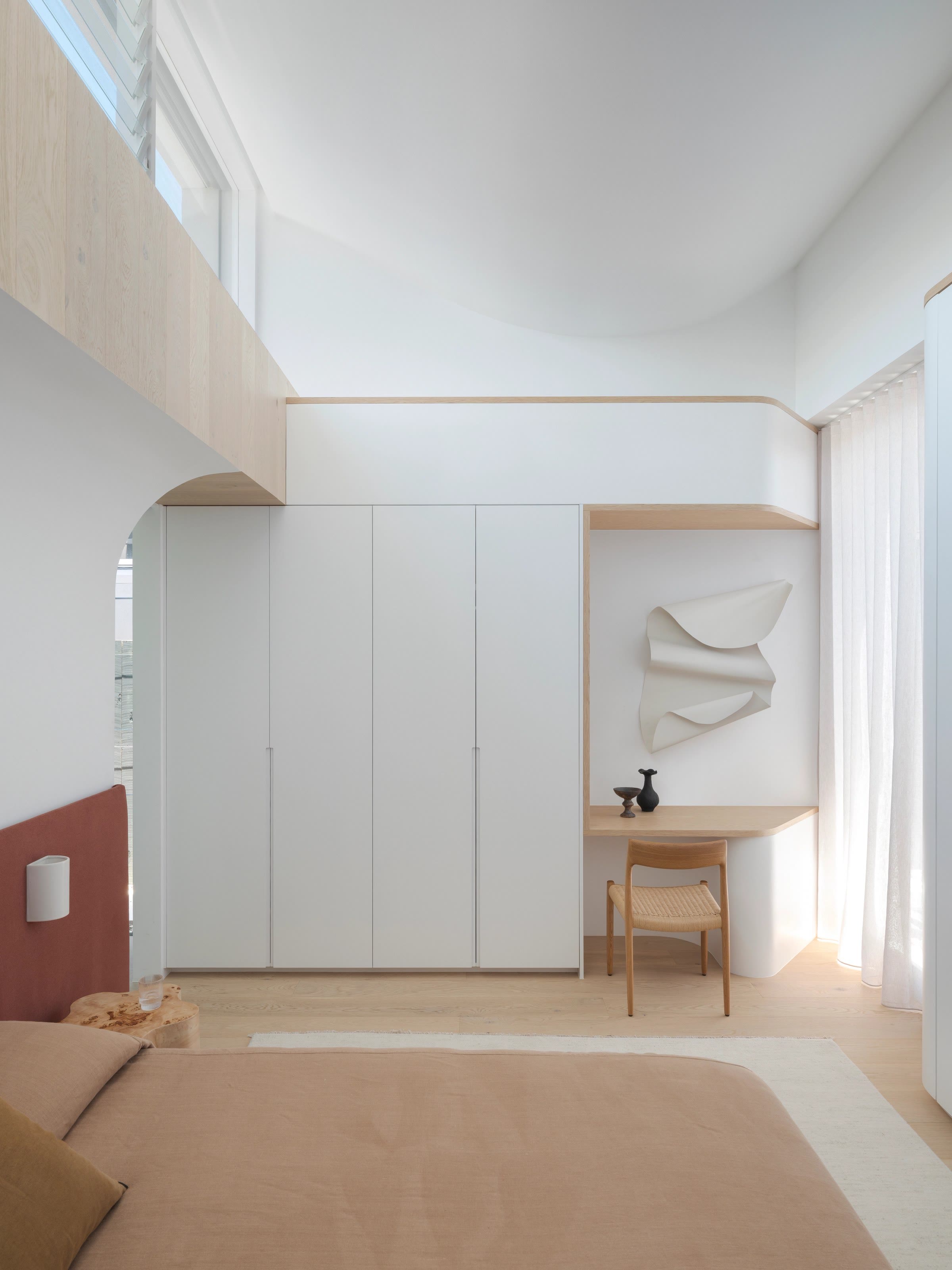
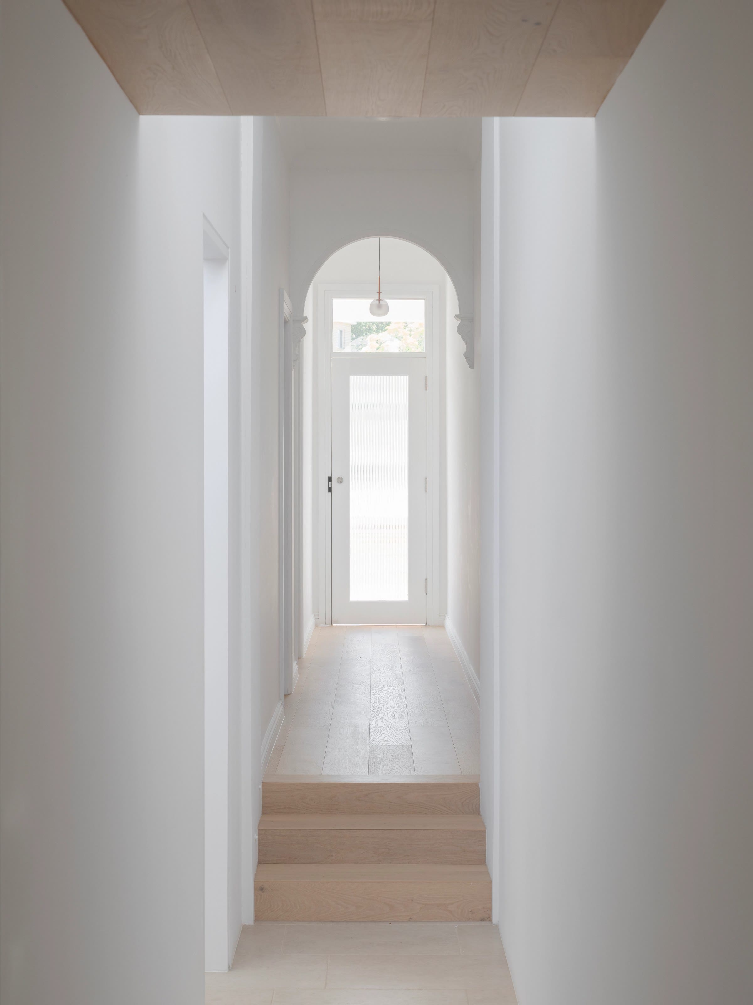
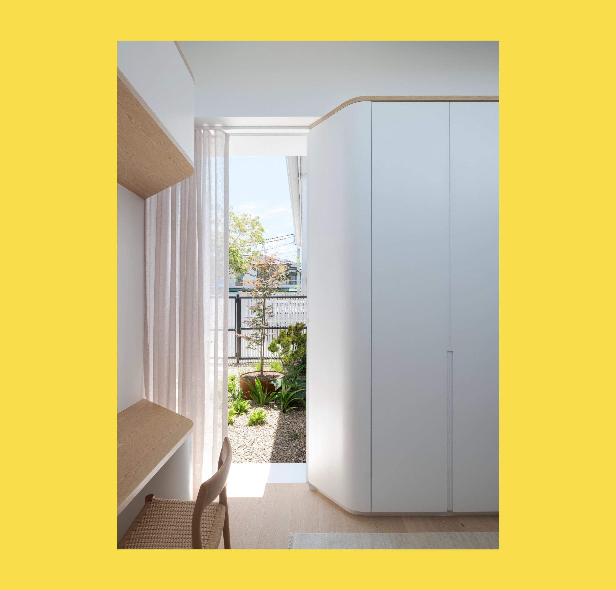
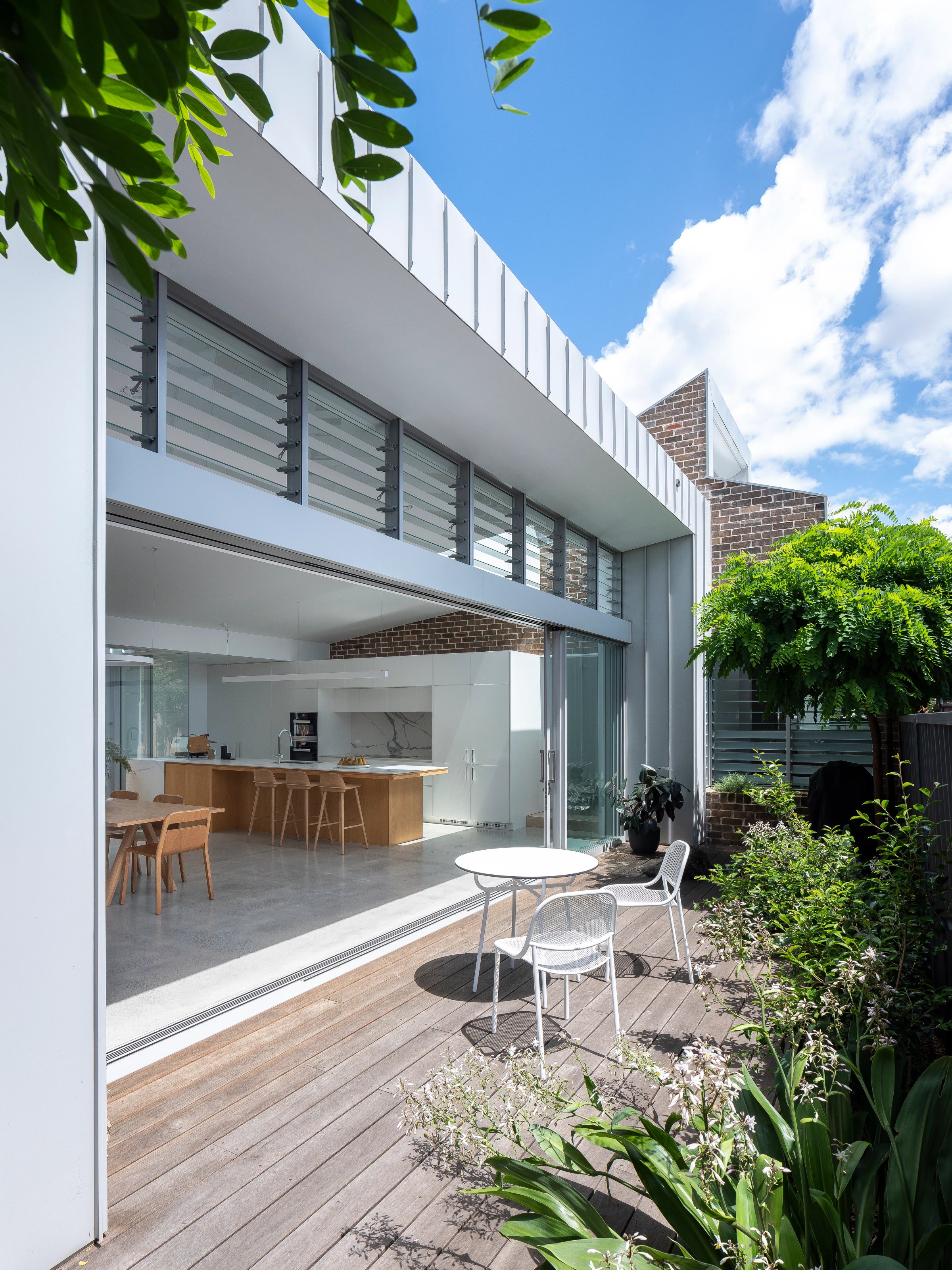
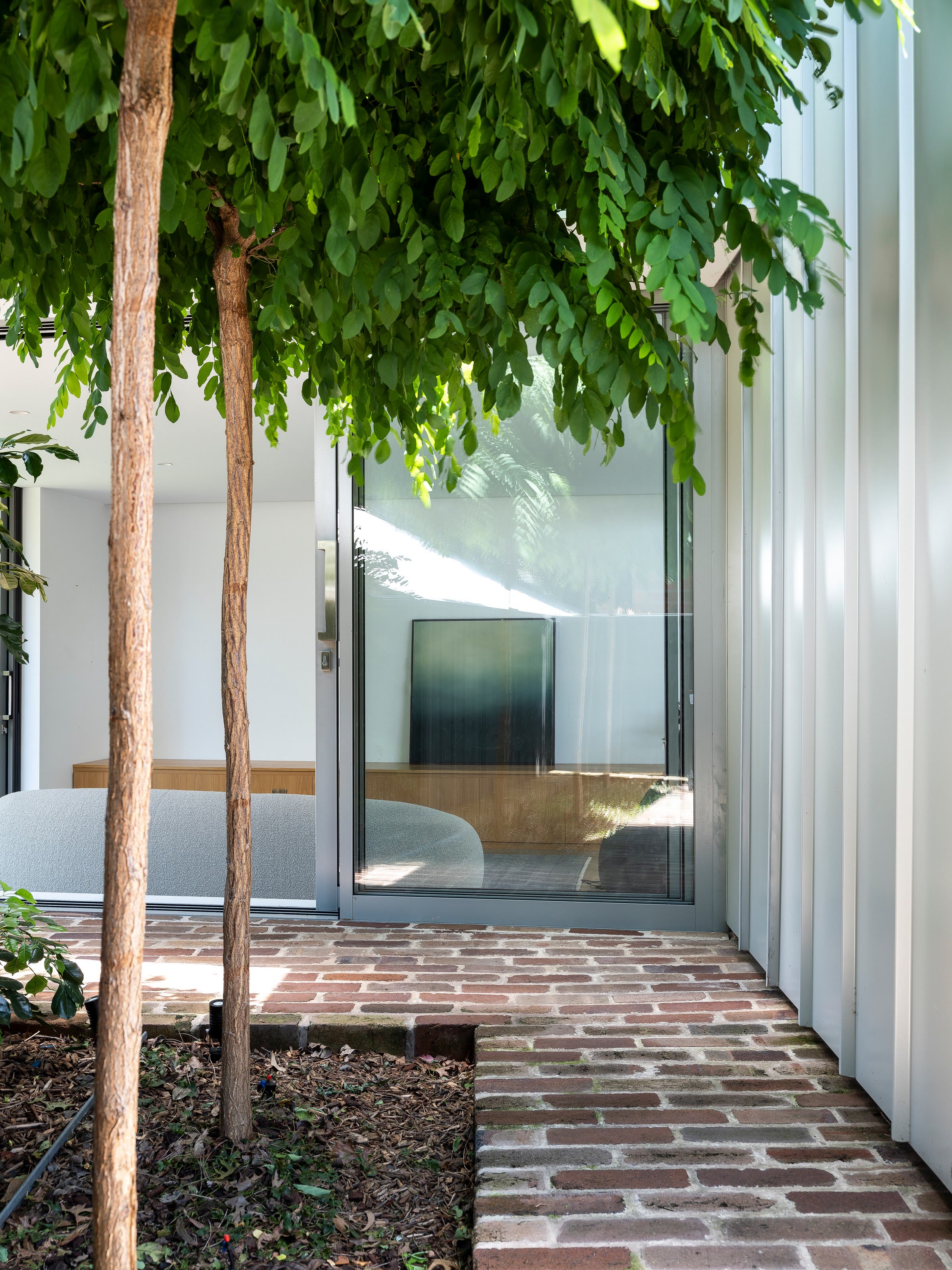
Alongside the identity, Clinton Weaver photographed a recently completed house and Place by Paul produced the visualisations recommended in the plan. We also advised on the website, its written content and the timing of the launch.
OUTCOME
Best launched in October 2026 with its new name, identity and website, presenting the practice's residential work across the city, coast and country in a manner consistent with the objectives set at the outset.
With a name, imagery and language that now carry the same quiet confidence as its architecture, Best has a presentation worthy of its clear ideas and genuine respect for material and place, and a strong foundation for the next stage of its work.
Brand identity and website by Studio Hi Ho. Visualisation by Place by Paul.