Appendix
Category;
Case Studies
DATE PUBLISHED;
12.12.2025
Credits;
Read Time;
Watch Time;
4M
Case Study: CHROFI
CHROFI is a Sydney-based architecture and urban design practice known for civic, distilled and quietly ambitious work rooted in landscape and context. Established in 2000 following its competition-winning design for the TKTS booth in Times Square, New York, the studio has since produced a widely awarded body of civic, community, residential and public domain work, including Maitland Riverlink, The Goods Line and the Harbord Diggers redevelopment.
With that reputation firmly established, the directors engaged Office D.SHARP to reaffirm the practice's brand and develop a refreshed marketing plan, so that its communications would express the distinction of its architecture as clearly as its record of awards. The plan is now being implemented, beginning with new project photography and a refresh of the practice's identity, templates and website.
THE BRIEF
The directors approached Office D.SHARP in mid-2025, with the brand review delivered in October and the completed plan in December. As an established practice with a substantial record of awards and a strong base of repeat and referred clients, CHROFI wanted to build further on that position, strengthening its reputation for design excellence among clients, collaborators and peers, and being considered more often for design excellence competitions and other prominent civic opportunities in Sydney.
Their aim was also to refine the practice's brand and communications so that they expressed the studio's design-focused culture more clearly. The team wanted to take a greater part in industry forums such as juries, panels and talks, and to continue growing in sectors such as social and affordable housing and education.
BRAND REVIEW
We began by holding workshops with the directors to understand the practice's values, objectives, ideal clients and key strategic challenges. We then assessed the studio's branding, website, imagery, social media and client-facing documents against a detailed framework covering imagery, messaging, tone, distinctiveness and consistency, benchmarking the practice against a group of ten Australian studios across the same criteria.
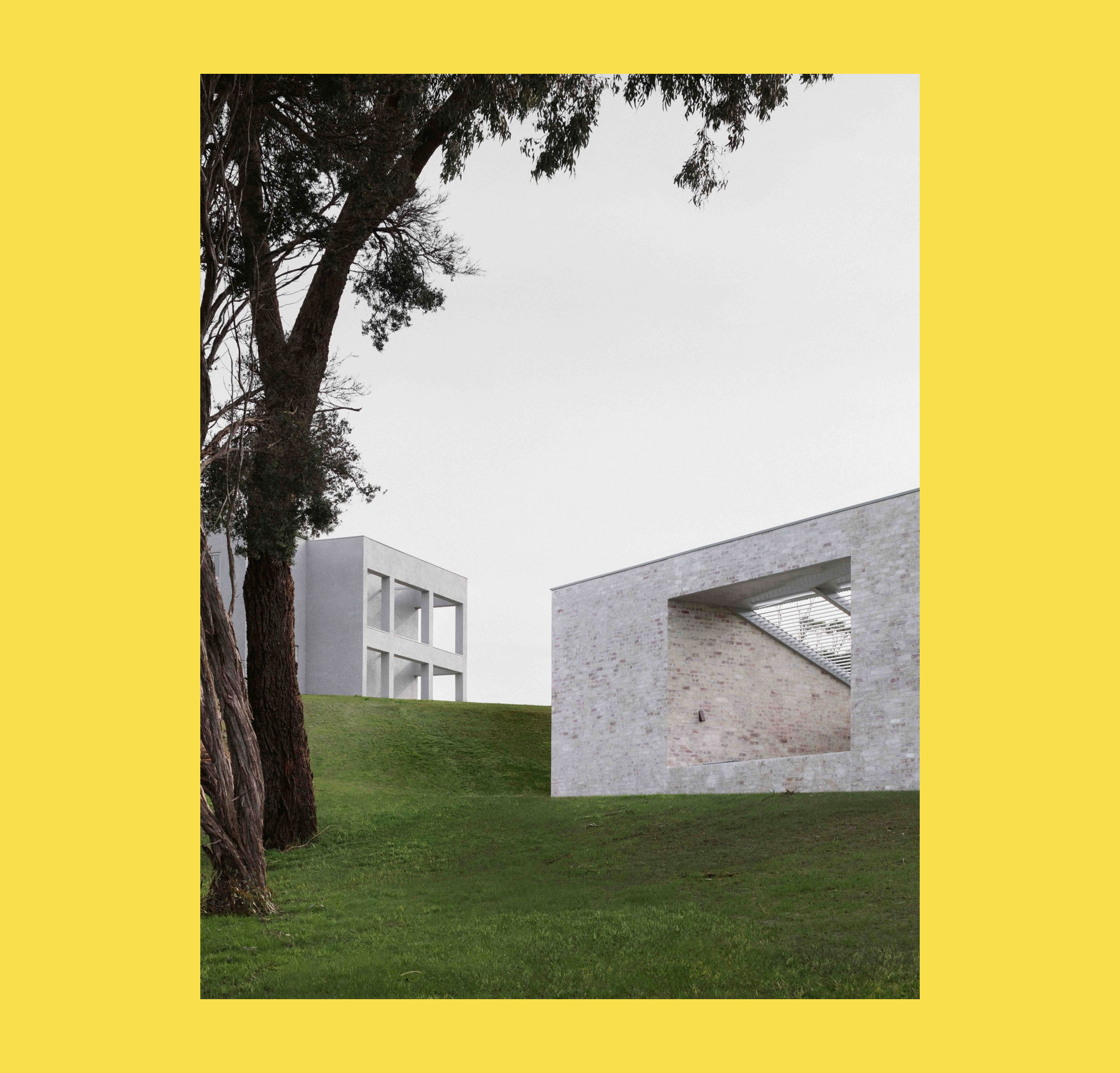
The practice's website, the presentation of its team and the best of its finished project photography were clear strengths, conveying the calibre of a studio with a long record of awarded work. The areas requiring attention were the written messaging, which could say more about the qualities of the built work, and the consistency of the practice's documents and project imagery.
POSITIONING
Following our review, we conducted workshops with the directors to develop a set of positioning concepts that describe the practice and its architecture. The concepts centre on work that is civic in purpose, distilled in form, quietly ambitious and memorable to the people who use it, and the practice now uses them when briefing writers, designers and photographers.
We also worked with the directors to agree three measurable objectives, focused on increasing brand awareness in the Australian architecture market, elevating the practice's brand image and presentation, and growing consideration for Sydney's design excellence competitions.
TACTICS
Once positioning and objectives were agreed, we developed a detailed marketing plan for the year ahead in which project content received particular attention. We recommended photographers suited to a refined, sculptural style, identified the projects to photograph first, and advised commissioning visualisations in portrait format at natural focal lengths. We also recommended a consistent, pared-back approach to drawings and closer oversight of project photography commissioned by other parties.
On branding, we recommended retaining and refining the existing identity rather than undertaking a full rebrand. We suggested that the practice establish a relationship with a graphic design studio to refine the current website and unify its documents and templates, leaving it well placed for a more comprehensive rebrand in future years, and we provided a shortlist of suitable studios for this work.
On media, we produced a media kit template and a list of target publications, and identified awards and speaking opportunities for the practice to pursue. We also recommended a newsletter and website journal, along with initiatives to strengthen relationships with clients and collaborators, and set out each action in a timeline for the year ahead.
IMPLEMENTATION
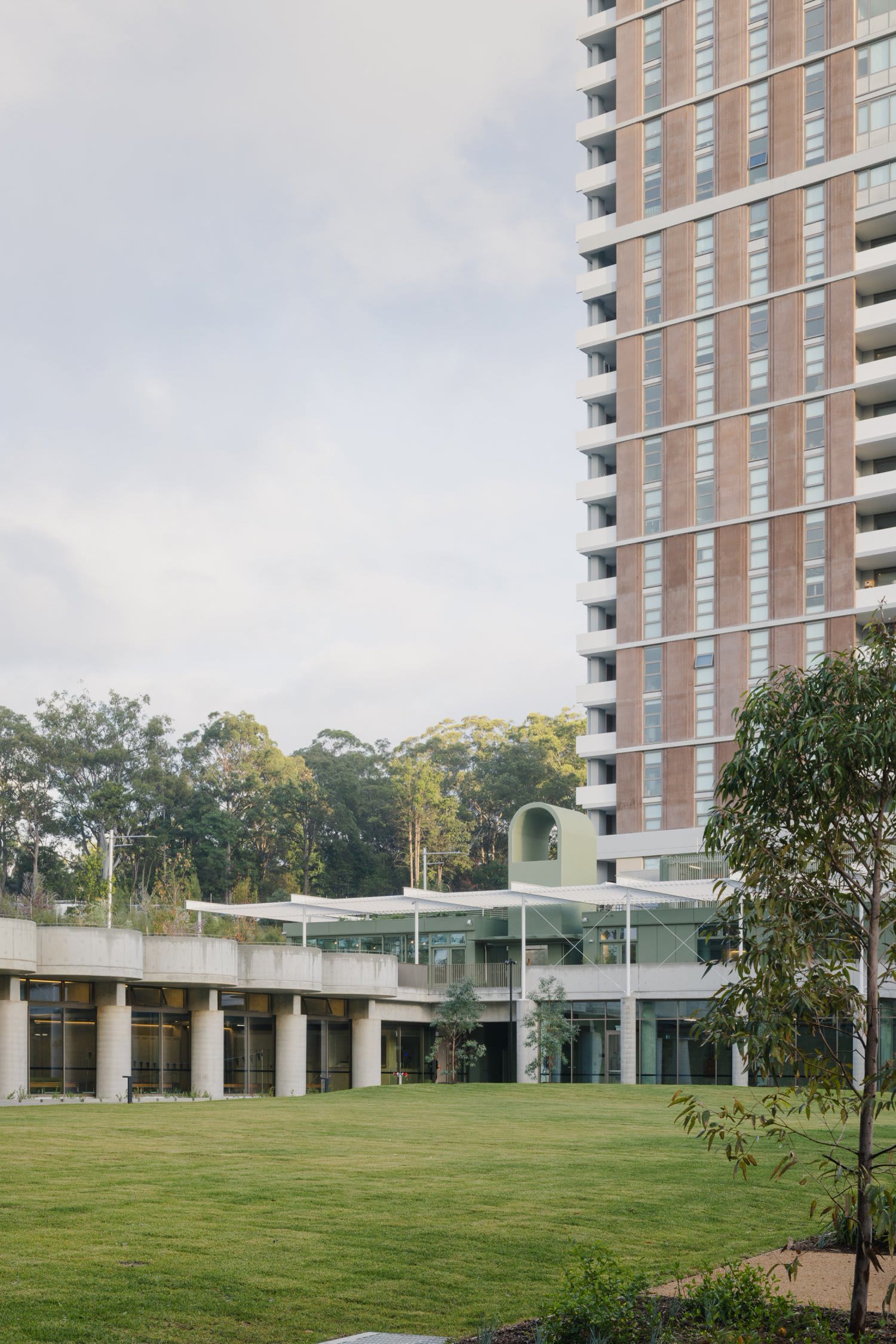
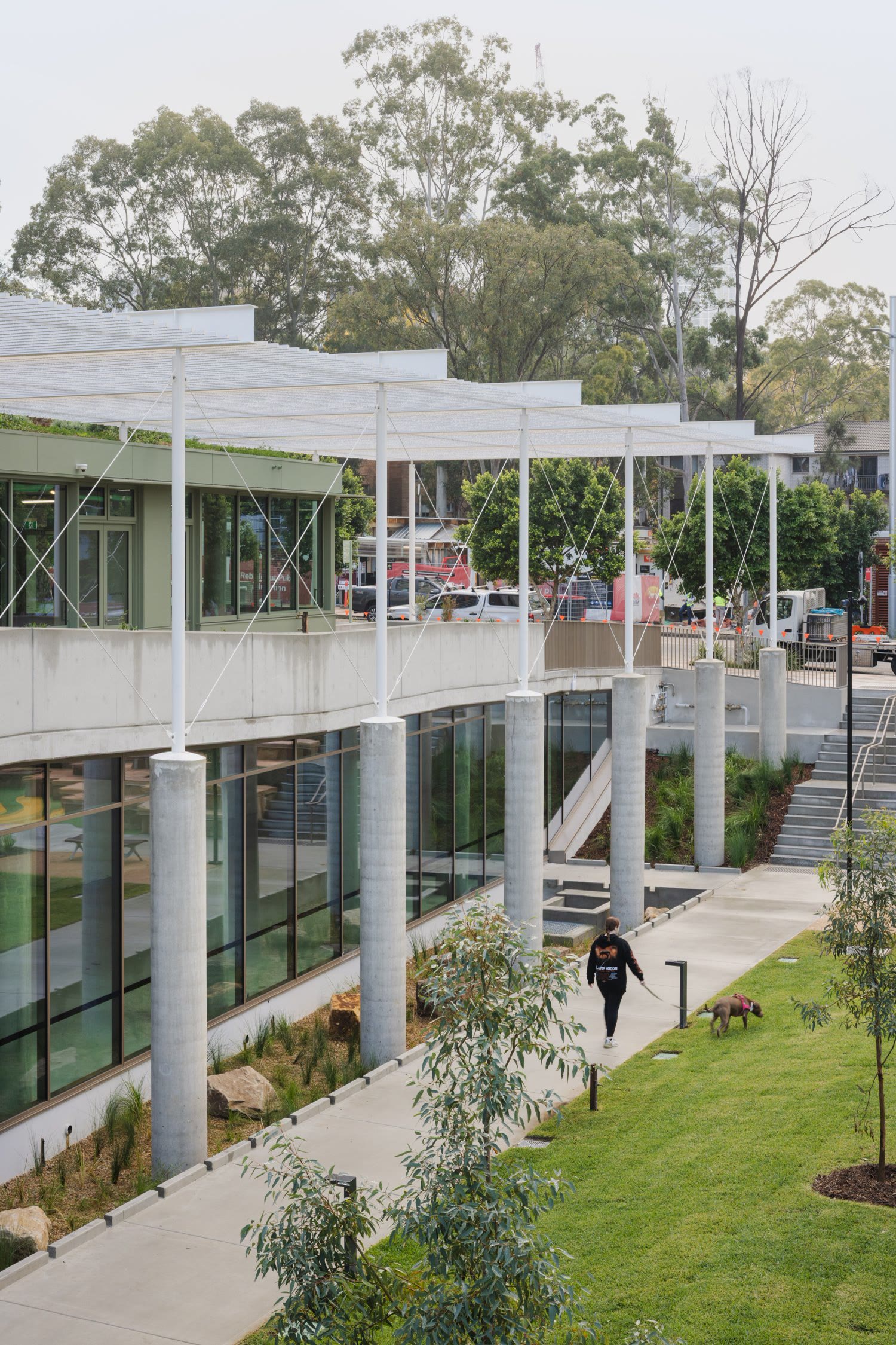
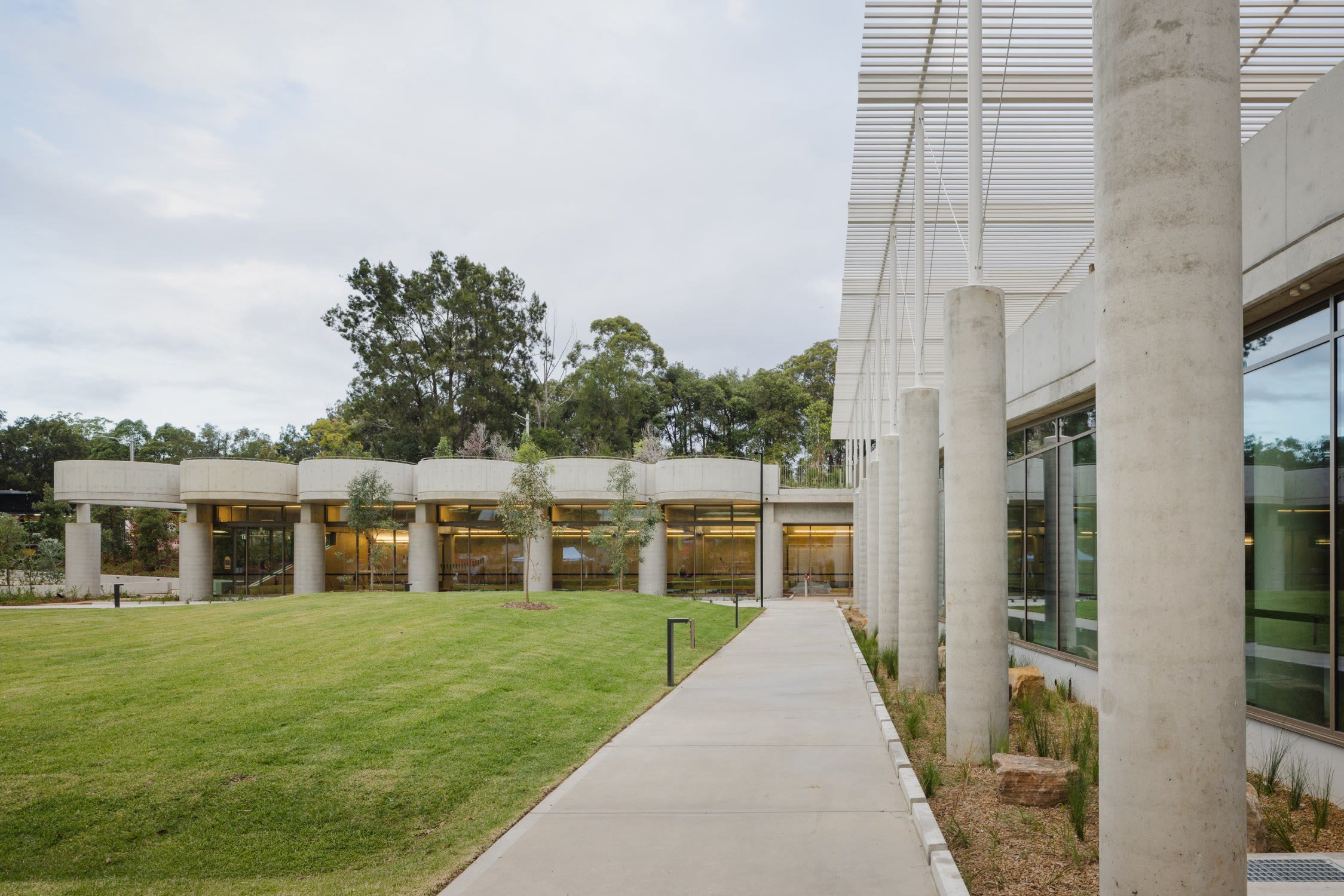
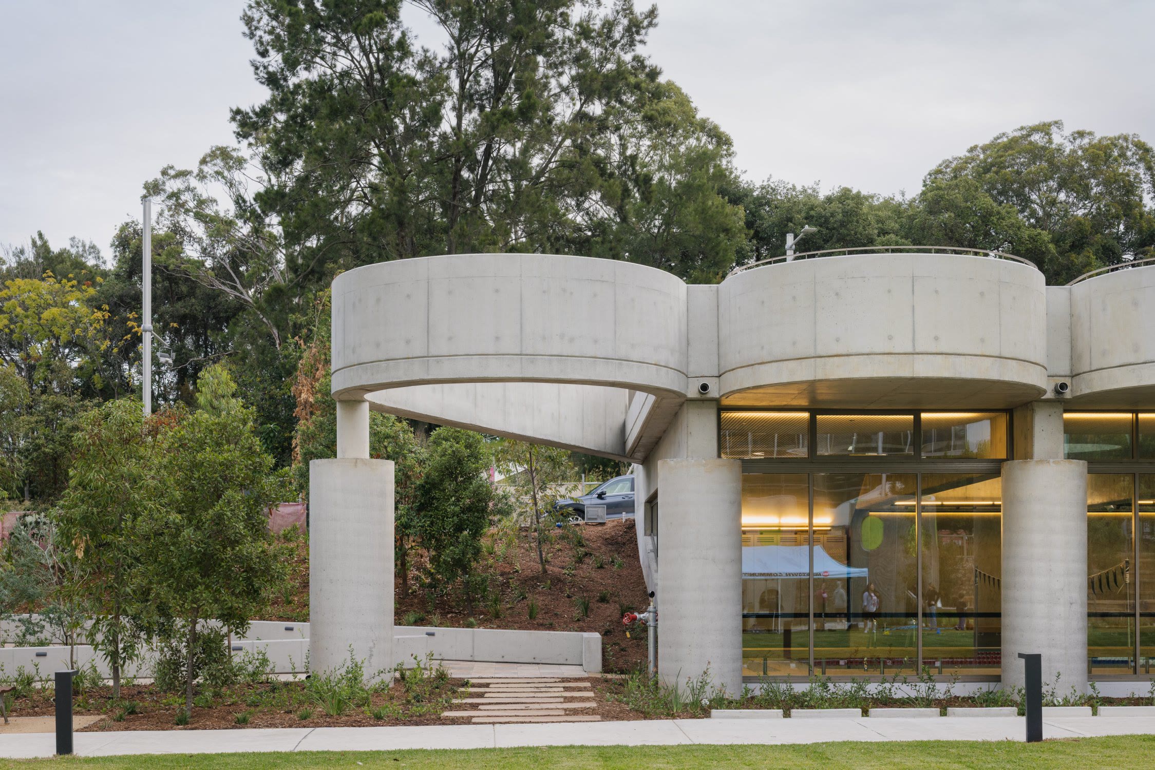
CHROFI began implementing the plan in 2026. Ivanhoe Community Centre and Pool, completed in 2026, was photographed by Clinton Weaver, one of the photographers we recommended, and now leads the practice's website. The practice has appointed The Company You Keep (TCYK), one of the design studios on our shortlist, and a refresh of the identity, templates and website is under way. We continue to advise the practice as this work progresses.
CHROFI's civic architecture has earned recognition at home and abroad, and its marketing now rests on a positioning and plan that match the ambition of that work. We look forward to seeing the refreshed identity and website as the work continues.
Brand refresh by TCYK. Images by Clinton Weaver, Luke Hannaford, Doug and Wolf and Ben Hosking.