Appendix
Category;
Case Studies
DATE PUBLISHED;
1.9.2026
Credits;
Read Time;
Watch Time;
4M
Case Study: Not All Architecture
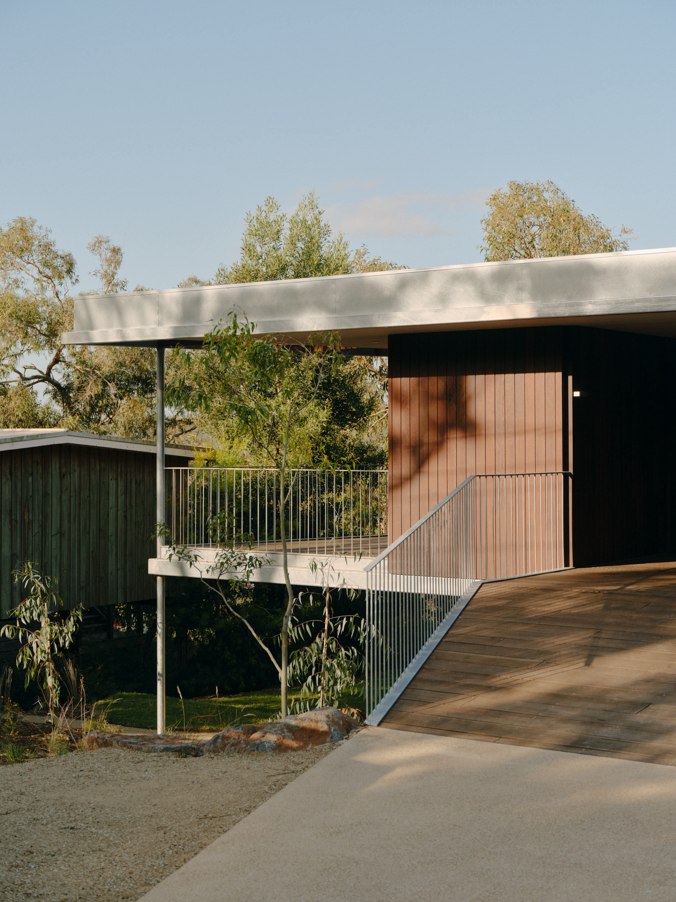
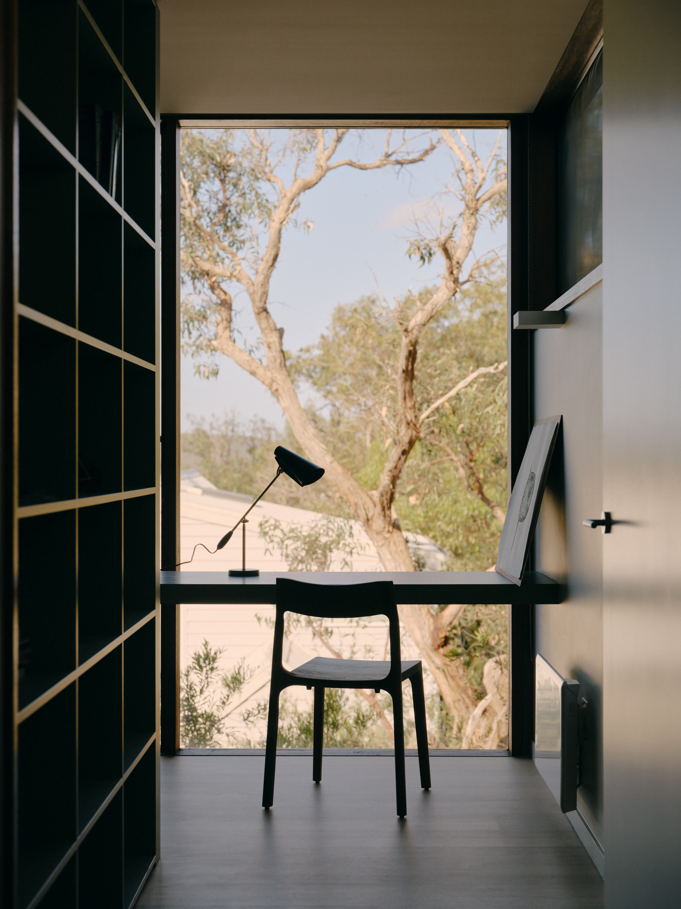
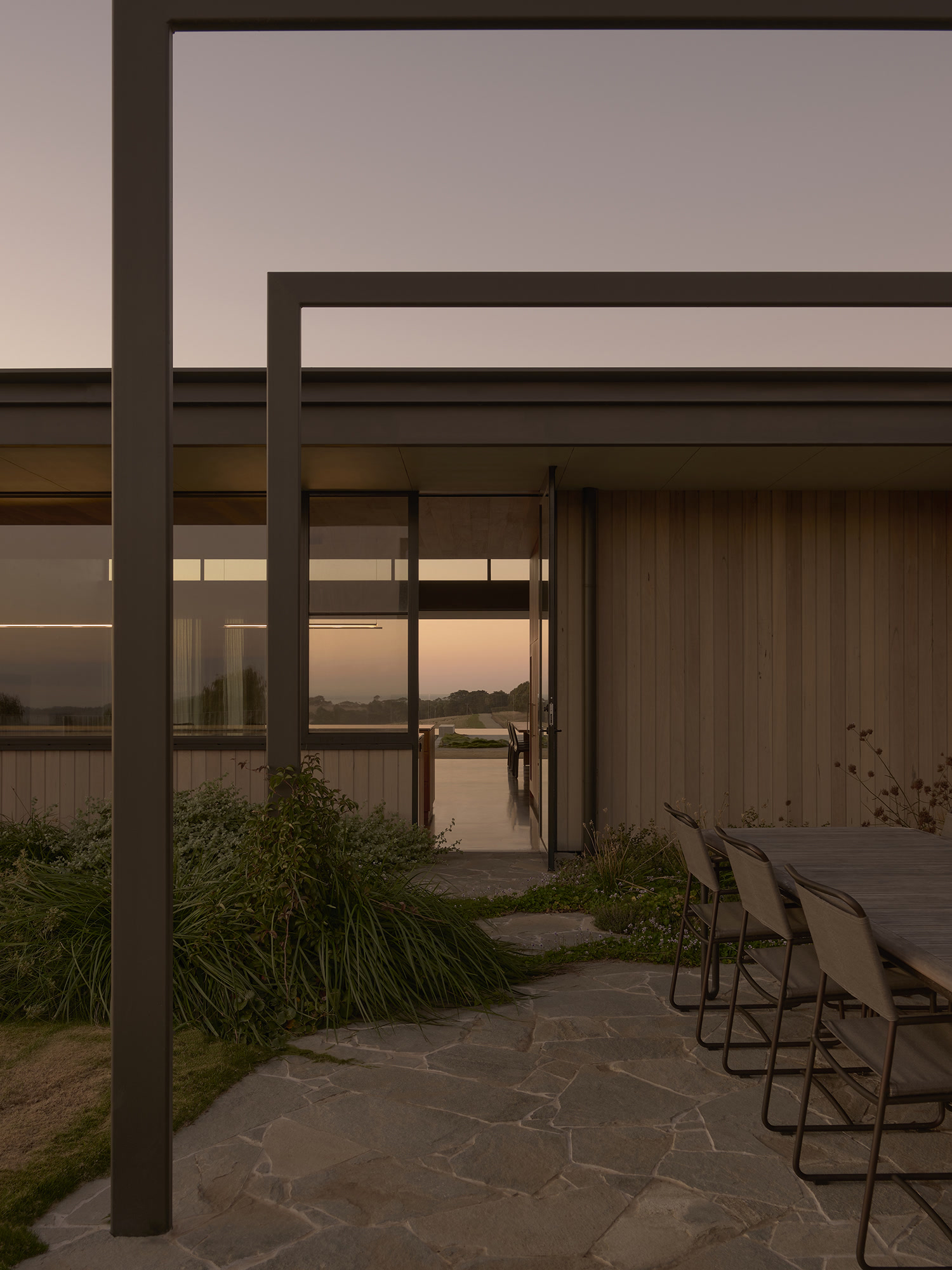
Founded in 2018 by Phoebe Clarke and Timothy Stelzer, Not All Architecture is an Anglesea-based practice designing houses for coastal sites along Victoria's Surf Coast, in towns such as Anglesea, Jan Juc, Breamlea and Fairhaven. Bringing architectural training together with direct experience of construction and furniture making, the practice is known for grounded, carefully detailed houses that respond closely to their landscape, local character and community. Its work has been shortlisted in the Houses Awards and the Australian Institute of Architects awards, and published by The Local Project, Est Living, Design Anthology and ArchitectureAU.
Office D.SHARP worked with Not All Architecture to review its brand, understand how its clients experienced the practice and develop a marketing strategy timed to the completion of its next houses. The practice has since begun to refine its website with its existing graphic designer, the first step in putting that strategy into practice.
THE BRIEF
Directors Phoebe Clarke and Timothy Stelzer approached Office D.SHARP in 2026, with the completed marketing plan delivered in September. With several houses approaching completion, they wanted a clear strategy in place before those projects were photographed and released, so that each could be presented to the press, to awards programs and to the practice's own audience in a considered sequence.
Alongside this, they wanted the practice to be better known, both within the Australian architecture community and among prospective clients along the Surf Coast and the Great Ocean Road. We began by holding a workshop with the directors to understand the practice's values, objectives and ideal clients.
BRAND REVIEW
We then assessed the practice's branding, website, imagery, writing, social media and client-facing documents against a detailed framework, benchmarking them against a group of practices nominated by the directors. The calm and understated website was a clear strength, as were the photography and drawings of the completed houses and the presentation of the practice's awards and media recognition.
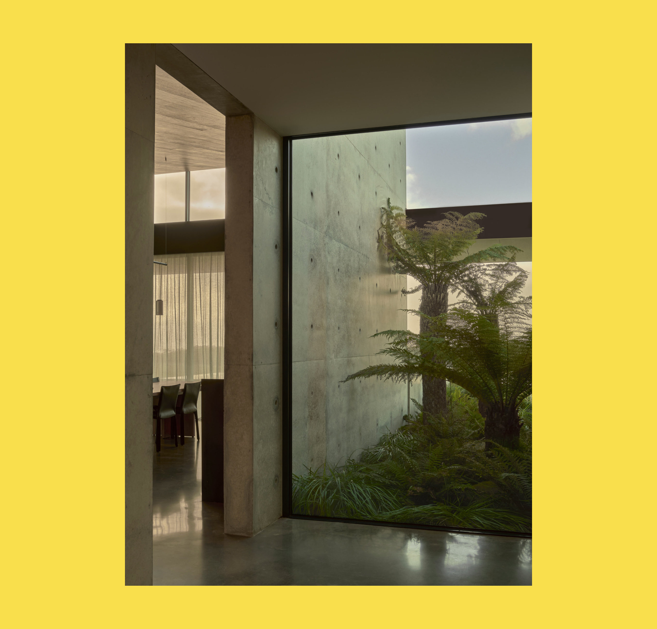
The area that most warranted attention was the practice's writing. The directors had already set out a clear set of values in their own planning, including craft, groundedness and a connection to nature, and we felt the public descriptions of the work could carry more of that outlook, so that the words conveyed the qualities of the houses as clearly as the images did. We also saw scope for greater consistency in the practice's imagery.
CLIENT RESEARCH
To complement the review, we interviewed a number of the practice's clients about their experience of commissioning and building a house with the studio. The interviews gave us an outside view of what clients valued in the practice and how they described it in their own words, and we brought these insights into the positioning workshops alongside the directors' own notes on their site-driven approach to design.
POSITIONING
Drawing on the review and the interviews, we developed the positioning with the directors over a series of workshops. It is built around four ideas: respectful, connected, purposeful and grounded. Together they describe an architecture that is sympathetic to landscape and community, responsive to local character and seasonal change, built from robust natural materials with considered detail, and firmly anchored to its site. We wrote them as an internal reference for briefing photographers, writers and designers.
The objectives for the first year focus on increasing awareness of the practice within Australian architecture, lifting the standard of its presentation as measured against our review framework, and growing consideration for residential commissions in the coastal towns closest to the studio.
TACTICS
Once the positioning and objectives were agreed, we developed a detailed plan. An important recommendation was to keep the existing brand identity. Rather than a comprehensive rebrand, we recommended that the practice return to its graphic designer to refine and simplify the website so that it focuses attention on the houses, and to prepare templates for client documents, media kits and a newsletter.
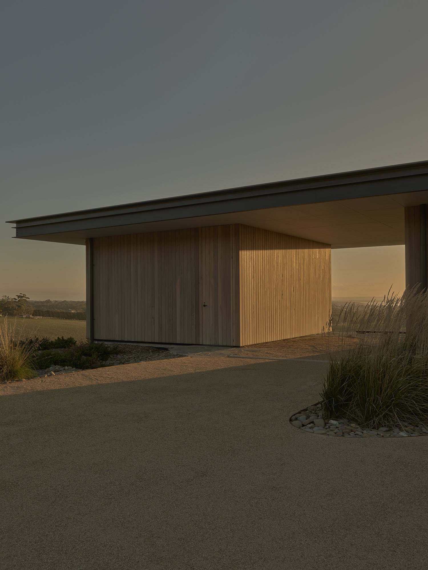
Project content received particular attention. We recommended a consistent approach to the photography of completed houses, commissioned visualisations and written descriptions for forthcoming work, and a common drawing style across the portfolio. We also set out a clear process for approaching publications and awards as each house is completed, along with a structured way of maintaining relationships with past clients and collaborators, accompanied by a 12-month timeline.
OUTCOME
Implementation has begun with the website, which the practice is refining with its graphic designer, and the remaining recommendations will follow as each new house is completed. We continue to advise the directors as the plan is put into practice.
Not All Architecture is a practice whose houses show a rare closeness to their sites and to the coastal communities they belong to. With clear positioning and a considered plan now in place, we look forward to seeing that work presented with the same care with which it is designed and built.
Brand identity by Gemma Mahoney. Images by Tom Ross and Madeleine Burke.