Appendix
Category;
Case Studies
DATE PUBLISHED;
9.4.2025
Credits;
Read Time;
Watch Time;
4M
Case Study: Studio Cobe
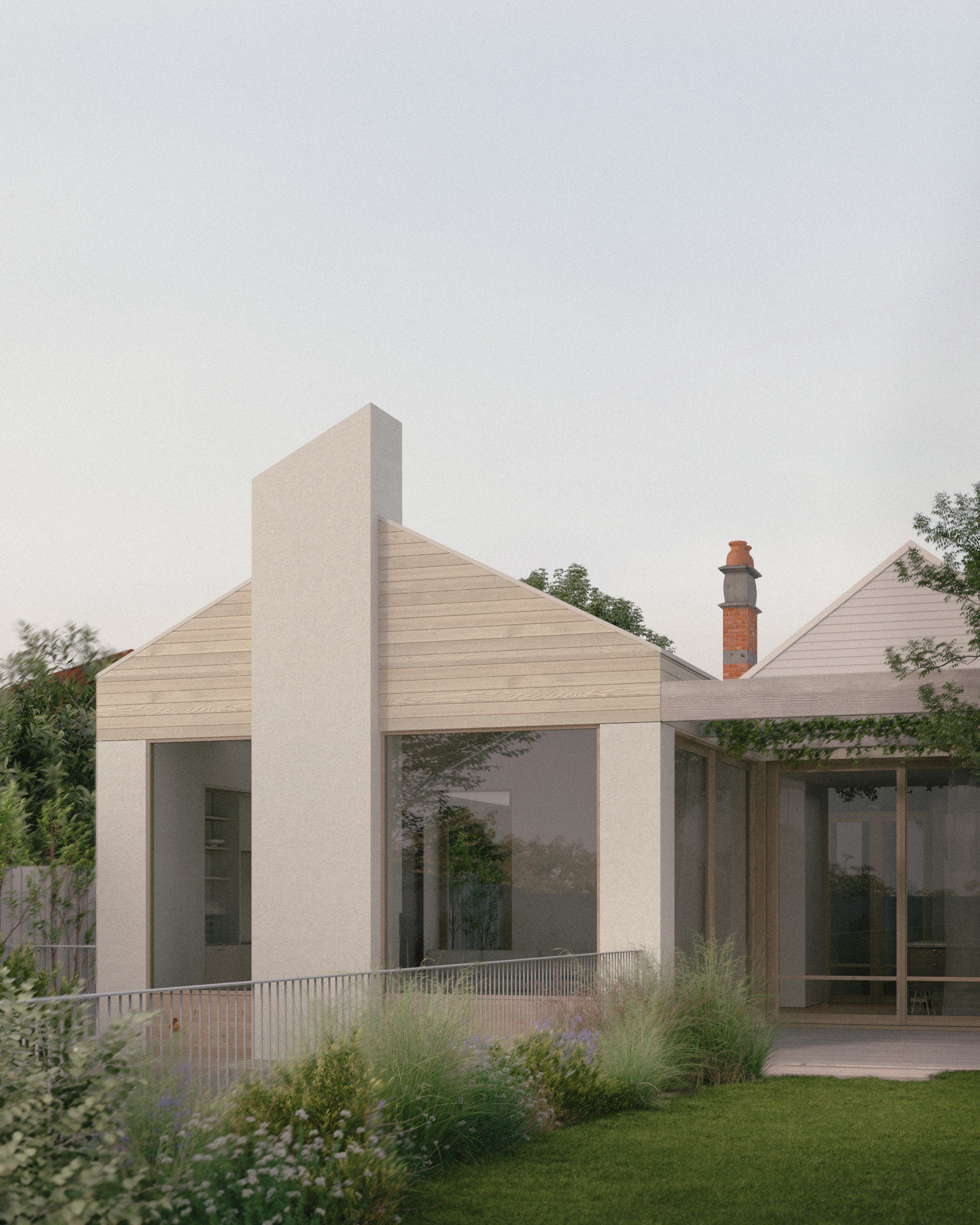
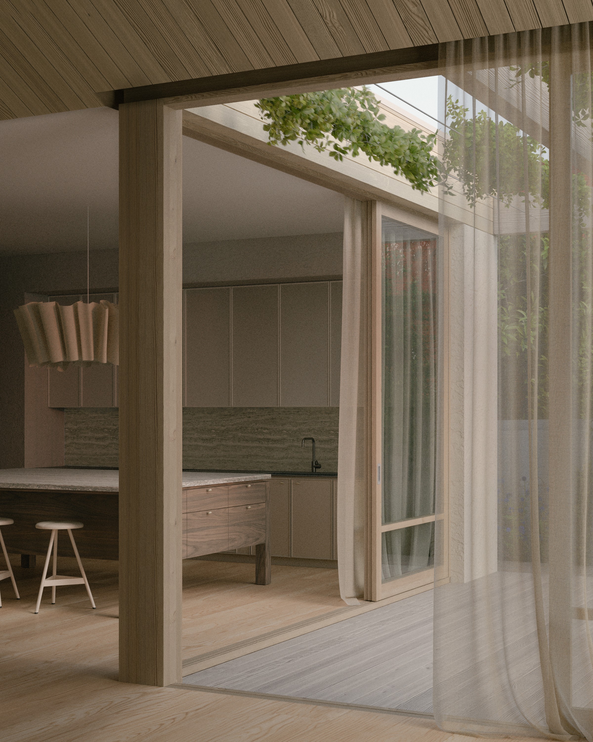
Led by director and registered architect Kate Corke, Studio Cobe is a residential architecture and interior design practice based in Elwood, Melbourne. The practice gives architecture and interiors equal weight, and its houses are known for their warmth, meticulous detailing, layered palettes of enduring natural materials and close connection to garden and landscape.
Office D.SHARP developed a marketing and brand strategy for Studio Cobe focused on how its work is photographed, described and presented, and then supported the practice as it commissioned new imagery, copywriting and a refined website that now reflect the character of its houses.
THE BRIEF
Kate approached Office D.SHARP in late 2024 to establish a clear direction for the practice's marketing and branding, with the completed plan delivered in April 2025. With most of its projects coming through word-of-mouth referral, Studio Cobe wanted to reach a wider audience of clients who value the craft of architecture.
Kate's aim was to clarify the practice's message, bring greater coherence to its website and written material, and have a structured plan to follow. She also wanted to consider whether the existing brand identity should be redeveloped.
BRAND REVIEW
We began with a briefing workshop with Kate, then assessed how the practice presented itself across its identity, website, imagery, messaging, social media and documents, benchmarking it against a selected group of Melbourne residential practices.
The architecture itself was a clear strength, well supported by the practice's recent visualisations and media coverage. The areas requiring attention were in presentation, where the brand identity, website and written messaging had yet to convey the warmth and rigour of the houses with the same clarity.
We then interviewed three of the practice's past residential clients about their experience of the process and their impressions of the studio. They consistently spoke of warmth, rigour and being listened to, and these themes fed directly into the positioning work.
POSITIONING
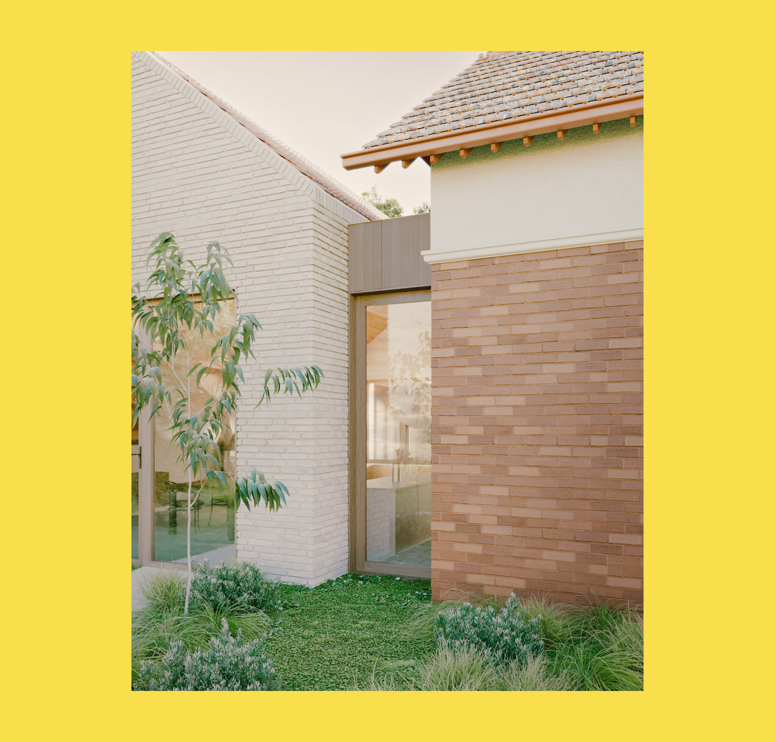
We worked with Kate in workshops to develop the positioning, which is expressed in four concepts: inviting, meticulous, textural and integrated. The concepts describe houses that are light-filled and centred on family life, resolved in detail, built from a restrained palette of enduring natural materials, and designed as a whole with their interiors and landscape.
The objectives for the first year focused on increasing brand awareness in the national architecture and interiors market, elevating the practice's brand image and perception, and strengthening repeat and referral business from existing clients and collaborators. During the later copywriting stage, the concepts were distilled into three words for public use: warm, enduring and rigorous.
TACTICS
Once the positioning and objectives were agreed, we developed a strategic plan for the following twelve months in which project content received particular attention. We set out creative direction for photography and visualisation and provided a shortlist of photographers, visualisers and writers suited to the positioning.
On branding, we recommended against a comprehensive rebrand in the first year, suggesting that the practice revisit the question later. In the meantime, we recommended that its existing designers refine and simplify the website to focus attention on the work, supported by a single practice statement.
IMPLEMENTATION
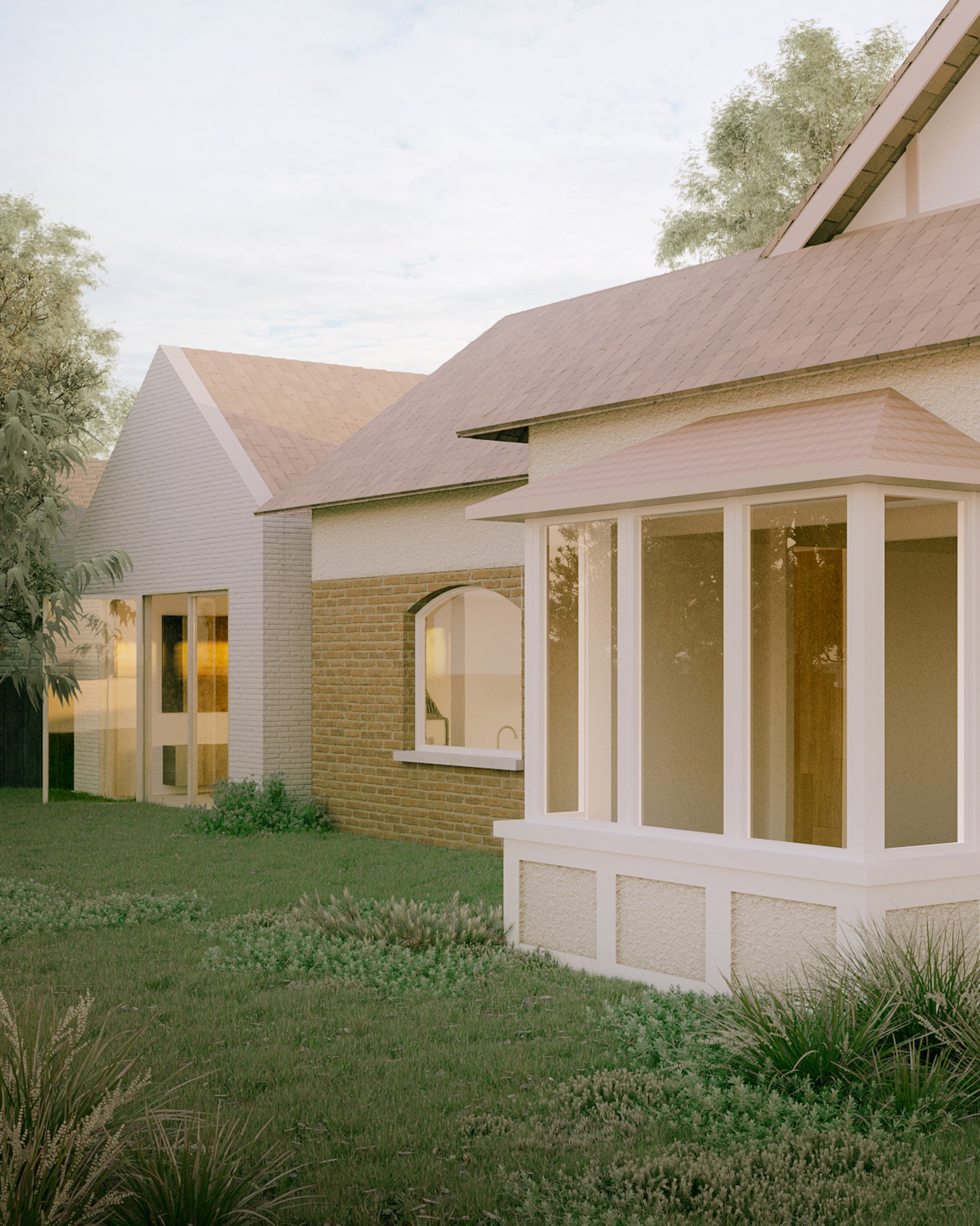
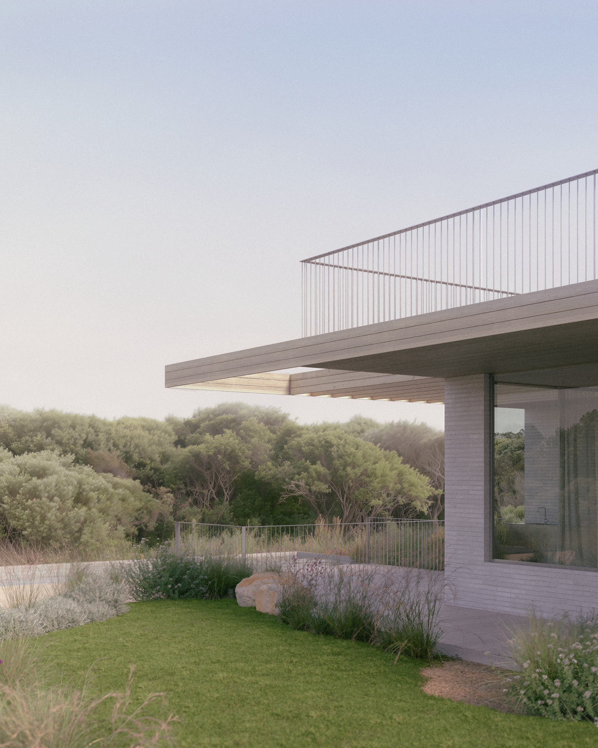
Once the plan was in place, the practice began commissioning the recommended work. Rebecca Gross wrote the practice statement, biography and website copy, and AKLR, the designers of the original identity and website, simplified the site and redesigned its project pages around the photography. The practice also commissioned new visualisations for projects in the design stage.
Orrong, a substantial reworking of a Victorian terrace, was photographed by Jack Lovel with styling by Bek Sheppard during the engagement. We continued to advise through this period, reviewing copy drafts, website designs and visualisation views as they were produced, and later in 2025 we held a progress review to set priorities for the following quarter.
OUTCOME
The updated website presents the practice with greater calm and consistency, with photography and visualisations as the focus of each page and concise written content that reflects the agreed positioning. Orrong has since been shortlisted in the IDEA awards.
Studio Cobe's houses are warm, enduring and rigorous, and the practice now presents them in the same terms across its website, its written voice and its imagery. Having achieved this by refining its existing identity, it has a sound base from which to consider a new identity at a later stage.
Visualisations by Commonroom and Paul Lau.